No matter how eye-catching a safety warning sign is—whether it has vivid color, gripping language, clear symbols or all three—it blends into the background after about 30 days.
Safety professionals have dubbed the phenomenon, caused by the human brain’s tendency to downplay familiar sights in favor of new sensory data, “sign blindness.”
It doesn’t happen only in workplaces. Drivers often become numb to street signs they pass routinely, which is how some receive tickets for failing to slow down in more restrictive speed zones that are part of their daily commutes.
Combating that tendency is a vital element of effective workplace safety signage, which begins with the basic elements of color, shape and letter-size detailed in OSHA Standard 1910.145 and an ANSI guideline incorporated by reference to some of its provisions.
The signs are “there for attention purposes, for training and they’re meant to be readily recognizable,” says Phil Zee, vice president for channel and content strategy at safety-sign maker AccuformNMC. “Visual acuity is critical.”
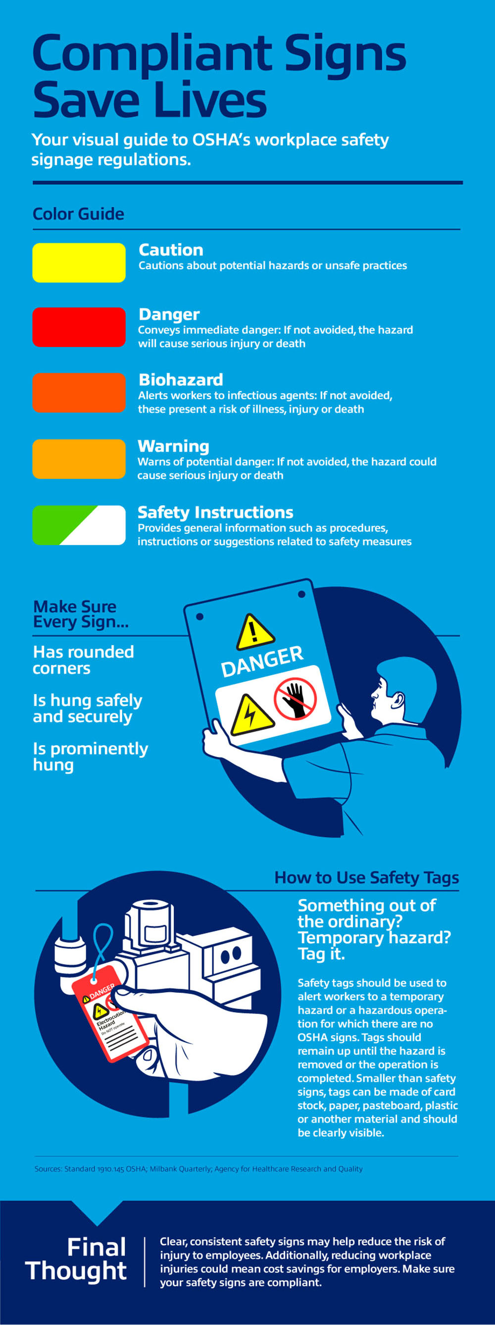
Along with requiring that signs be hung prominently, OSHA establishes colors to designate different types of messages: Red is used for danger signs, yellow for caution, orange for biohazards, gold for warning and green and white for safety instructions.


Talk to Us!
Leave a reply
Your email address will not be published. Required fields are marked *